CASE STUDY

Spacebar

The energy bar market is bursting with sweetened bars targeting athletes and fitness enthusiasts. Spacebar aims to be the rare savory bar, aimed at busy professionals, specifically working in tech.

A laptop on a table in an office with the Spacebar website on the screen.

META-CHALLENGE invent, design and brand a product.

UNDERLYING TASK design and develop a website to showcase that product.

MY ROLES research, branding, design, development and implementation.

Competitive Analysis

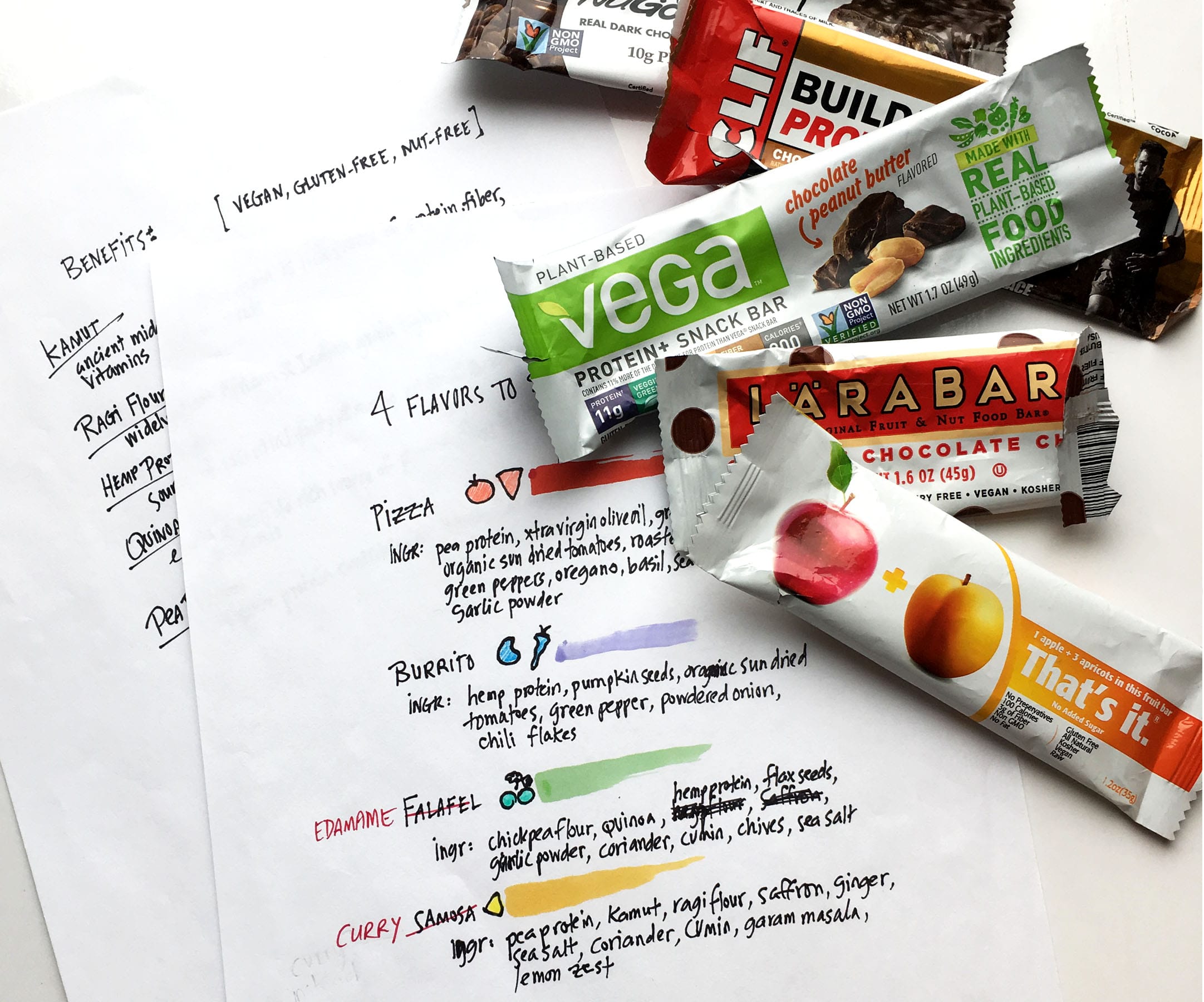
The energy bar market seems ready for a savory, nutritious alternative given it’s strength—doubling yearly since 2015—and recent adverse publicity regarding the sugar content and nutritional value of some bars. The introduction of meat bars, such as Hershey’s Krave (in blueberry barbeque beef) and General Mills’ Epic Bar (in bison, salmon and venison) seems to bear this out. Interestingly, these newcomers aim not for the athlete, but for the average semi-active consumer. Additionally, consumers I surveyed pointed toward healthy ingredients (100%) and taste (81%) as top attributes for selecting bars, with fitness promise ranking significantly lower (25%).
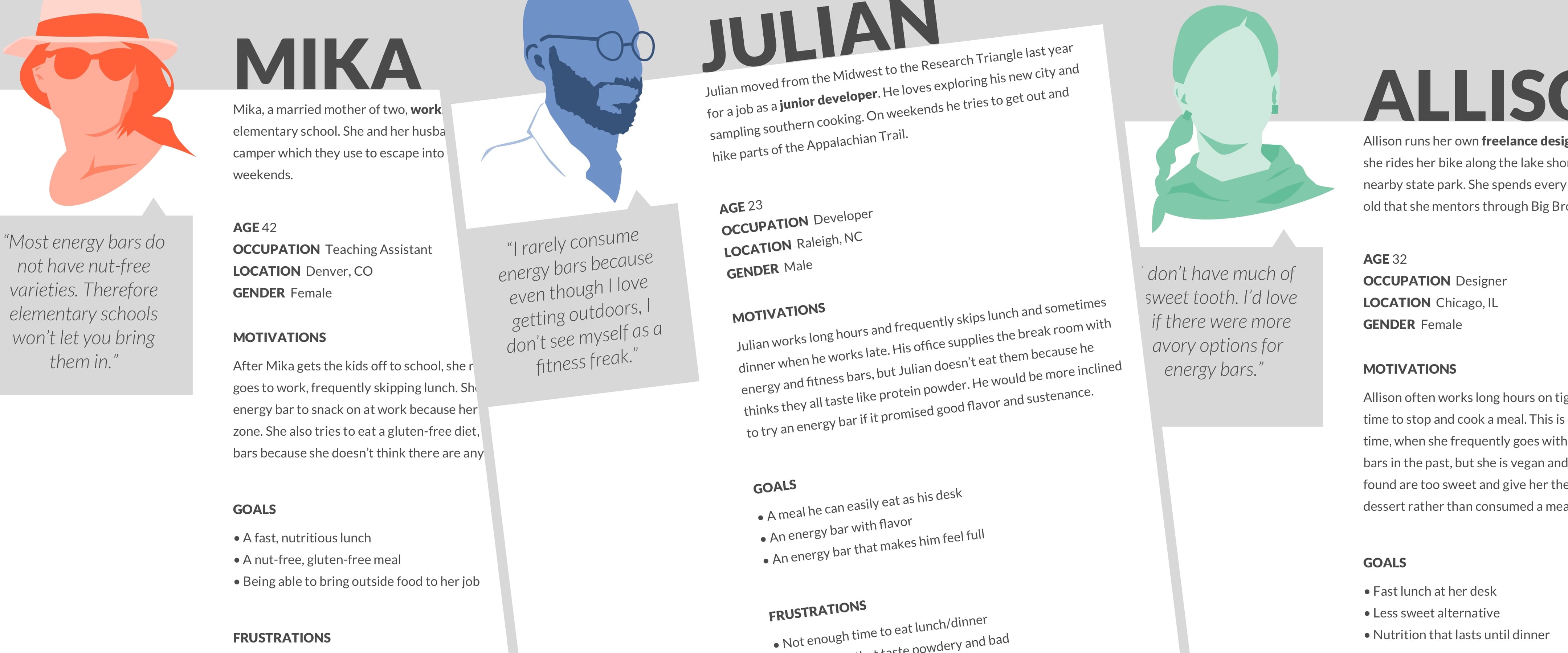
drawing of a woman representing a survey participant

Energy & nutrition bar consumption in the U.S. is highest among 25-54 year olds.

bar chart

When asked to choose the top three factors that lead to the purchase of an energy bar, 100% of those surveyed selected ingredients, 81% selected taste, 25% selected fitness promise and 6% selected packaging.

Personas

In addition to office professionals, I rounded out my personas with a tangential group: busy people, such as working parents, who don’t necessarily work in an office environment but are often too busy to stop for a meal. I imagined a subsidiary advertising campaign that could target this group.

a collage of three graphics representing three personas

Brand name

I began by brainstorming with word lists and mind-maps, flushing out obvious references and hacking into more inventive ideas, with graphic possibilities and marketing connections hovering in the wings. After multiple surveys, the name Spacebar emerged as the clear choice. A keyboard’s spacebar is used to create a space, or to pause music or video, connecting with the idea of pausing and creating a space to eat.

a pile of papers scattered across a table with words and mindmaps scribbled on them

Logo

I envisioned a minimal, almost generic word mark for the logo. I searched through fonts that had a tech feel without being too obvious and settled on Orator, a monospace font originally designed for the IBM Selectric typewriter. I selected a gray similar to Apple’s space gray. I used the keyboard spacebar icon and played around with breaking the word in two. I narrowed down my designs and surveyed potential consumers, 52% of which chose the logo design that closely resembles a keyboard spacebar. Finally, I chose Roboto for the brand's secondary typeface.

a sheet of paper with logo ideas printed on it the final logo in several sizes with a color swatch and sample fonts

Design research

Before I began package design, I researched existing products for ingredients, texture and flavor. I sampled a dozen or so bars, and created flavor profiles based on foods both popular and nourishing, working out hypothetical ingredients for each, as well as talking points for copy.

a photo of sheets of paper with ideas written on them and a pile of empty wrappers sketches and mockups of packaging ideas

Package design

I mocked up multiple sizes and styles of packaging, deciding early on to go with a horizontal layout that mimicked the shape of a keyboard spacebar. I drew loose vector icons that I used as a background pattern, and came up with a color palette. In the end, drawn icons and color seemed too much of a departure from my original generic concept. Many iterations later I settled on a white package with simple flavor-identifying shapes.

spacebar packaging pizza flavor spacebar packaging curry flavor spacebar packaging edamame flavor spacebar packaging burrito flavor

Content

With branding and package design complete, I focused on copy, which would inform the site's content areas. I invented testimonials by popular tech publications, designed a social media contest and created a tie-in with Apple Watch, with an app that could send alerts to users when it was time to eat. I sketched out rough flows that embodied these content areas which I used to render low-fidelity mockups in Sketch. I created an Invision prototype with two options and solicited feedback from fellow designers, who steered me in the direction of the more dynamic layout.

website design sketches website low fidelity mockups

Development + implementation

After extensive image research, I dropped my assets into Sketch and saved them out using image compressors to minimize file size. I iterated through a few high-fidelity mock-ups and solicited critique from potential consumers and colleagues. Feedback led me to consider whether the audience for the product was clear enough—I decided to use movement to express the brand more clearly, which I roughed out in an Adobe After Effects animation. Throughout development I shared my work-in-progress with colleagues who weighed in on various design and coding challenges. I used CSS Grid Layout combined with Flexbox for the structure of the site, and Javascript with the Scrollmagic and GreenSock Animation Platform libraries for the animation. I also made good use of browser development tools, particularly Firefox’s grid inspector and responsive design mode.

website high fidelity mockups freeze frame of an animation idea

Conclusion

I was glad that I wasn’t forced to make any major design compromises during the development process, which I anticipated might happen. I did have to adjust my animation plan—luckily, the result was a better fit in the end. After testing the site on iPhone, Galaxy Note, iPad and iMac, I shared it with a handful of users. Here are some of their comments:

“Wow! This is great. The page is very clean and has great white space.”
Aidan

“Easy to navigate... I like the large text with nutritional info.”
Allison

“Your site looks amazing. Clean design and I love what you did with the shapes!”
Amanda

Check out the live site and the Github repo.