CASE STUDY

Small Cap Survey & Consulting

This client came to The Ocean Agency for assistance in launching a consulting practice. Our team worked with him to define his brand and create an online presence.

Laptop with website on screen.

META-CHALLENGE to help our client launch their business.

UNDERLYING TASK design and develop a brand and website.

MY ROLES research, branding, design, development and implementation.
Competitive Analysis

During the discovery process of the project, our team identified a handful of potential competitors, some of them quite large players in the organizational survey research space. What separated our client from the competition was the target audience—companies of 500-2500 employees—and the ability to offer a high level of experience and technology without the usual pain points of money, effort and time.

blurred websites

Branding and Logo Design

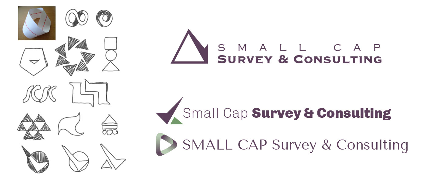
Our mission was to design a classy and professional logo. We began brainstorming around shapes reminiscent of a compass, to convey direction and leadership, a checkmark to reflect the more literal elements of the survey process, a Mobius strip, representing the ongoing process, and finally a triangle which connected to the three-step process. We worked with a deep purple hue, a color often associated with wisdom, and a contrasting olive green, a nod to growth. The winning choice was a one-color logo whose mark combined the triangle and checkmark, paired with the businesslike Copperplate in two weights.

logo designs

Content

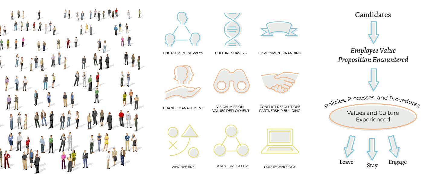
Our client provided us with a large amount of written content as well as numerous charts and graphs which would inform the architecture of the site. We divided the content into logical sections and assigned a color scheme to each section. All of the icons and charts were custom drawn in a simple, relatable style. We chose a hero graphic for the home page that connected to the company’s mission of seeking to solve problems associated with people and culture.

wireframes

Development + implementation

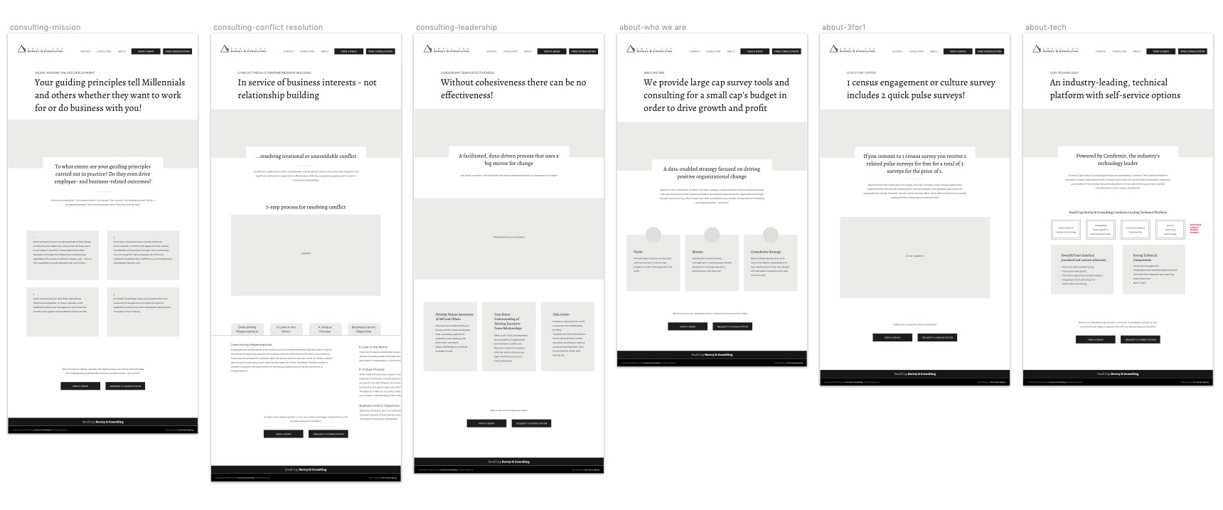
After mapping out the sitemap in Balsamiq we used Sketch to create low-fidelity wireframes that we used for a prototype that our client reviewed in Pastel. After a couple rounds of feedback and revisions, be built the site out in WordPress.

wireframes

Conclusion

Our client was very satisfied with the end result. Through an extremely collaborative process we were able to deliver an effectively branded website that he could begin using immediately to connect with prospective clients. View the live site.